Most Shopify merchants respond to flat revenue by chasing more traffic. But the cheaper fix is usually already sitting on the store: a conversion problem, not a traffic problem. Fixing how well existing visitors decide, through better Shopify conversion rate optimization, moves revenue faster than another ad campaign does.
Product comparison pages solve exactly that. They give shoppers who are already comparing options a way to decide without leaving the store. No new ad spend, no new landing pages to drive traffic to, just a better path through the traffic already arriving. This guide covers why comparison pages work, what the data says, and how to add one to a Shopify store without a developer.
Why Shoppers Abandon Carts When They Can’t Compare Products Easily
Shopping decisions are rarely absolute. A visitor rarely asks “is this product good?” They ask “is this better than the other two I’m considering?” The research confirms this pattern:
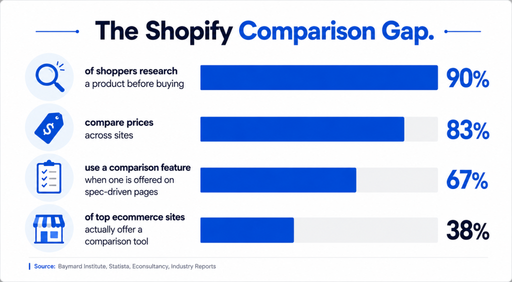
- 83% of online shoppers compare prices across multiple sites before buying.
- 90% of consumers research a product online before purchasing it.
- On spec-driven product pages, 67% of shoppers use a comparison feature whenever one is available.
Most stores don’t give shoppers that option. Baymard Institute’s usability research found only 38% of the top 60 ecommerce sites offer a dedicated comparison tool, and 17% of sites selling spec-driven products offer no comparison feature at all.
When a store doesn’t let shoppers compare, shoppers don’t stop comparing. They open a new tab and look elsewhere. Every open tab is a chance to lose the sale to whichever store made the decision easier.
The problem is worse on mobile, where most Shopify traffic now lands. Mobile conversion rates typically run at 1.8%–2.8%, against 3.2%–3.9% on desktop, largely because comparing specs across multiple product tabs is harder on a small screen. A single page that puts products side by side removes the tab-switching entirely, which matters most on the device where most visitors are already browsing.
What Is a Product Comparison Page?
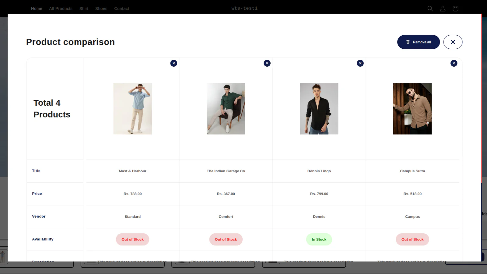
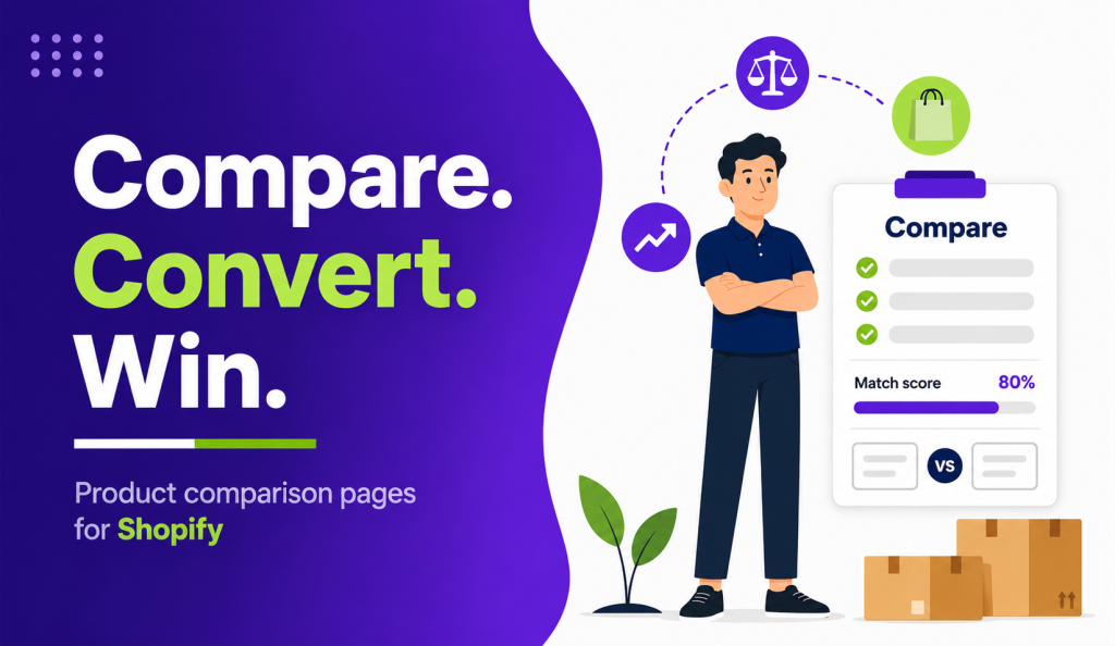
A product comparison page places two or more products side by side against the same set of attributes: price, specs, materials, warranty, shipping terms. It differs from a standard spec sheet. A spec sheet lists one product’s attributes in isolation. A comparison page highlights differences, so shoppers spot what matters instead of reading three separate product pages and comparing from memory.
On Shopify, comparison pages can be static (one page per product pair) or dynamic (built on the fly from a category page). Dynamic pages scale better for catalogs above 50 SKUs, since they don’t need a manual page for every product pair.
Comparison pages typically appear in three places: as a standalone page linked from navigation, as a popup or drawer triggered from a collection page, or as a module embedded directly on the product page itself. Spec-heavy categories (electronics, tools, automotive parts) tend to convert best with a standalone page, since shoppers in those categories actively seek out detailed comparisons rather than stumbling onto them.
The Conversion Math: Why Comparison Pages Lift Sales Without New Traffic
Comparison pages move conversion rate, not traffic volume, and that distinction is what makes them cheap to implement relative to paid acquisition.
| Benchmark | Value |
| Average Shopify store conversion rate | 1.4% |
| Top 10% of Shopify stores | 4.7% |
| Global ecommerce average (2025–26) | 2.5%–3.0% |
| Conversion lift from below-the-fold enhanced content (comparison charts, spec breakdowns) | Up to +15% |
| Monthly revenue added per winning Shopify Plus test | $6,000–$386,000 |
The gap compounds fast. A store with 20,000 monthly product page visits at a 1.4% conversion rate closes 280 orders. Lifting that rate to 1.9%, a gain several stores report after adding a comparison page, adds 100 orders a month with zero additional ad spend and zero additional traffic.
That’s the core argument: fixing decision friction on pages that already get traffic is cheaper than buying new traffic to hit the same revenue number. The same logic applies to average order value. Comparison tables that surface a higher-tier variant next to a base model give shoppers an easy upgrade path, which is one reason enhanced content below the product page fold is consistently among the highest-impact, lowest-cost tests merchants can run.
5 Elements Every High-Converting Shopify Comparison Page Needs
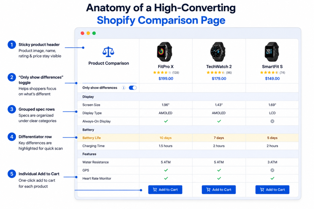
1. An “only show differences” toggle
Baymard’s usability testing found shoppers scroll past identical specs looking for what’s different. A toggle that hides matching rows cuts scan time significantly.
2. Grouped, labeled specs
Specs listed alphabetically or scattered across unrelated rows are hard to scan. Group by category (size, materials, performance) with clear subheadings, and avoid unexplained jargon like unlabeled speed multipliers.
3. Images alongside numbers
A pure spec table forces shoppers to hold a mental image of each product. Thumbnails next to the row data remove that extra step.
4. A persistent selection reminder
Shoppers who scroll a long comparison table often forget which products they’re viewing. A sticky header keeps product names and images visible at all times.
5. A buy button in every column
A single CTA at the bottom of the page forces an extra decision. Each product column needs its own clear “Add to Cart,” so the comparison page itself can close the sale.
SEO Benefits: How Comparison Pages Capture “Vs” and “Best” Search Intent
Comparison pages target a distinct search intent that standard product pages can’t rank for on their own: queries like “[Product A] vs [Product B]” or “best [category] for [use case].” These are lower-competition, high-intent searches, since the person typing them has already narrowed their options to a short list.
Comparison pages also strengthen internal linking. Linking to a comparison page from category pages, individual product pages, and a dedicated product filtering setup gives search engines a clearer signal about how products in a catalog relate to each other, and it keeps shoppers moving between pages instead of leaving the site to research elsewhere.
Structured data matters too. Marking up comparison tables with product schema helps search engines understand price, availability, and rating data per column, which supports rich results in search. This is separate from the ranking value of the page’s written content, which still needs unique framing rather than a repeated spec dump, since search engines devalue pages that differ from similar pages on the same site only in the products named.
How to Build a Comparison Page on Shopify Without Custom Code
Hand-coding comparison tables for every product pair doesn’t scale past a handful of SKUs, and static tables go stale the moment a price or spec changes.
A dedicated Shopify product comparison app solves both problems: it pulls specs directly from product metafields, so the table stays in sync with the catalog automatically, and it generates SEO-optimized comparison pages without manual page-building.
Pairing a comparison tool with product filtering lets shoppers shortlist items to compare in a click instead of hunting through a full catalog. Pulling ratings into the comparison table via a reviews app adds a trust signal directly inside the decision point, instead of leaving it buried on each individual product page.
Common Mistakes That Kill Comparison Page Conversions
- Comparing too many products at once. More than four columns raises cognitive load and slows scanning instead of speeding it up.
- Leaving spec labels unexplained. Jargon without a tooltip or plain-language label forces shoppers to guess, and guessing kills confidence.
- No CTA per product. A single button at the bottom forces shoppers to scroll back up, adding friction at the exact moment they’re ready to buy.
- Letting specs go stale. A comparison table with outdated pricing or discontinued variants erodes trust faster than having no comparison page at all.
- Hiding the page from navigation. A comparison page with no internal links from category or product pages won’t get found by shoppers or indexed well by search engines.
Frequently Asked Questions
Do comparison pages create duplicate content problems?
Not when each page targets a distinct product pair or set with its own canonical URL. Duplicate content risk rises only when the same spec block is reused word-for-word across pages with no unique framing or context.
How many products should one comparison table show?
Two to four products is the practical limit. Beyond that, scanning becomes harder and the table’s usability advantage disappears.
Will a comparison page help a store with low traffic?
Yes. Comparison pages improve how existing visitors convert; they don’t depend on additional traffic to work, which makes them one of the more efficient levers for smaller stores.
Can a comparison page be added without hiring a developer?
Yes. Apps built specifically for Shopify product comparison generate tables from existing product metafields and handle the SEO page structure automatically.
Where should comparison pages be linked from?
Category pages, related product pages, and filtered search results. Internal links from high-traffic pages are what get comparison pages found and indexed.
Do comparison tables slow down Shopify page speed?
Only if built with heavy, unoptimized custom scripts. Purpose-built comparison apps are designed to load within standard Shopify theme performance budgets.
Final Thoughts
A comparison page doesn’t need a traffic campaign to pay off. It needs to sit in front of visitors who are already deciding, and give them the side-by-side view they’d otherwise open a competitor’s tab to find. For most Shopify stores, that’s a conversion lever sitting untouched in existing traffic.